

How to Tailor Your Customer Analytics & Reports to Appeal to Three Different Internal Stakeholders (Your Agents, Managers, and the C-Suite)
You’re ready to walk into a monthly meeting tomorrow with your VP of Ops when your phone lights up with a dreaded “ding!” – an after-hours email from your boss.
You know that meeting you have tomorrow? Yeah, turns out your boss wants you to present important metrics in front of your COO now, too.
*Queue the anxiety*
What now? Sure, you use customer analytics in tons of different ways in your contact center. There’s the daily data you share with your agents. Then the weekly reports you review with your supervisors. And, even the simplified dashboards you typically share in your monthly 1:1 with ops leaders. But how do you know what customer data actually matters to all these different stakeholders?
When company leaders want to unlock more revenue or put a nail in the coffin of customer churn, how do you show them the impact of your call center operation? And, what reports are the best to give your agents enough performance data to help them, not overwhelm them?
Turns out, only a measly 1% of contact center leaders feel fully confident in their current data strategy. Let’s change that.
Learn how to use customer analytics to create reports for 3 different audiences: managers & supervisors, agents, and your exec team.

Creating custom reports helps you get a clear view of how your contact center is operating. And charts and dashboards let you visualize your data to spot customer insights you can act on.
Use your contact center’s reporting engine to create a variety of reports tailored to the needs of different people at your company. The beauty of customizable reporting is, you can change your data to reflect what each audience really cares about. Your COO cares about different metrics than your supervisors. And your agents are more concerned with their own performance over the ROI you’re getting on your contact center.
Queue up three different reports for unique stakeholders in your call center, so you can tell the right story with your data, no matter when the ask hits your email inbox.
How to Report on Customer Analytics for Supervisors and Managers
Managers (I’m looking at you!) and supervisors need an overview of how the contact center’s running. You want a clear picture of what’s happening with your customers and agents, day-by-day and week-by-week. Distill all the data living in your contact center down into a few important charts and graphs in your reports, so you can pull out actionable insights for coaching.
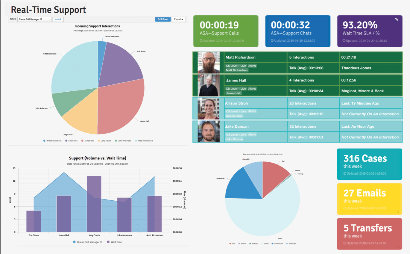
Visualize what’s happening in your call center with charts and graphs on data points like:
- Incoming support interactions (grouped by agent). Learn how interactions are flowing into your contact center and the workload it puts on each of your agents.
Bonus view: Look at incoming interactions grouped by interaction type, too. This gives you a view of how your customers reach out for help in addition to the workload of each agent.
- Big number statistics for some of your key metrics. Make your high-priority metrics a focal point of your dashboard.
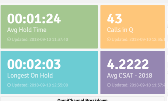
Here are a few popular ones in the Sharpen reporting engine:
- Average speed of answer for calls
- Average speed of answer for chat (this metric looks different for each channel)
- Percentage of adherence to wait time SLAs
- Total number of support cases for the week – to help you better predict and forecast volume for the future
- Number of transfers for the week
- A real-time support overview chart of your last 10 interactions. Drill down into a small sample size of your customer analytics so you can get detailed and look at specifics like; what channels your customers prefer, who keeps calling, who keeps answering, how long customers wait on hold, and how long are average handle times.
All of this data gives you and your supervisors tangible information to understand the bigger picture of your customer service experience. And, it loops you in on what’s happening with each of your agents and your customers.

For example, using these types of detailed reports and charts, you can follow a customer’s journey from their first outreach attempt all the way through to escalation. Or, you can see that a customer reached out three different times in one week looking for answers. And, you can see which agents handled these interactions, so you know where to offer additional coaching and training for a more seamless journey for future customers.
[Read Next] How to Use Customer Service Data to Inform Your Decision Making
The Reports and Dashboards that Matter to Your Agents
Your agents want to know how they’re performing against their goals. When you share daily metrics and progress with your team, they’re more engaged with their work and want to improve.
Create agent-specific dashboards with individual performance metrics for your team members (like Sharpen Performance Tiles). With agent tiles that highlight your most important metrics, your team can keep a pulse on their daily performance.
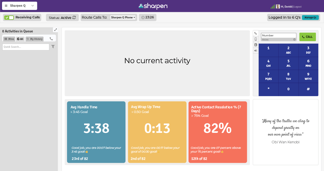
They can see at a glance how they’re performing against the goals you set. And, they can see how they’re performing against their peers, too. Often when agents underperform, it’s because no one aligned them to clear expectations. (If they’ve reached apathy, you have another problem on your hands).
The more context you can give your agents around their goals and metrics, the more they understand their impact on the customer experience. And that bigger-than-me feeling drives better performance and keeps your agents in their seats.
[Learn More] Sharpen customers used Performance Tiles and improved FCR by 5% in less than two weeks
Customer Data to Share With The C-Suite
A few of the most popular call center metrics relate directly back to company revenue. Highlight these metrics when sharing customer analytics with your C-Suite leaders. It’s your exec team’s job to make sure your company stays afloat and turns a profit. When a company needs to improve profitability, they’ll look to where they can trim costs in addition to finding new revenue sources.
So, give the people what they want. Be proactive and share important data with your top ops leaders on a regular basis. Report on metrics that tie back to your bottom-line, first. That way if you need buy-in on future projects, they understand the ROI of investing in customer service.
A favorite metric we often see call centers target is Average Handle Time. If you can reduce AHT by x%, you can typically solve more interactions in less time and trim agent hours by y%. That leads to fewer FTE hours for your contact center and more money to your bottom line.
But, don’t just share single metrics in a silo. In theory, a low AHT means your contact center maximizes resources and operates efficiently. But does obsessing over reducing AHT make your customer service better? What’s the opportunity cost of achieving that low AHT metric and running an ultra-lean operation? Choose a few other numbers from your customer analytics to supplement efficiency metrics like AHT, so your leaders get a feel for the quality of your service too.
In addition to AHT, share reports with your exec team that include metrics like:
- Average Hold Time – Fast customer service is still a top priority for 75% of today’s customers.
- First Contact Resolution – There’s a 1:1 correlation between improved FCR and improved CSAT.
- Employee Engagement – For every 1% increase in employee satisfaction, there’s a 1.3% increase in CSAT, according to a decade of research from Glassdoor.
When you improve each of the above metrics, your CSAT scores tend to improve, too. Since we know happier customers spend up to 140% more with your company after a positive experience, we also know that improving these three metrics linked to satisfaction leads to more customer revenue. Bam! It’s about time I told Mr. Miller, my middle school math teacher, I used the transitive property in the real world. (Please don’t hate me for throwing 6th grade math terms at you.)
Summed up, your executives care about metrics that relate back to money in the bank. Create reports and dashboards that tell the story of your contact center’s value and you’ll win over your leaders.

Your Step-By-Step Guide to Building Better Customer Experience Strategies
Use data you already have to build actionable strategies for a better customer experience